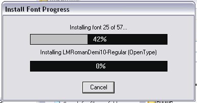
OK, mini-gripe time.
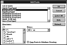
See this old dialog box from Windows 3.1? I'm getting flashbacks now; I actually kind of miss these dodgy old interfaces. This one was for picking new fonts to install, back when you always had to do it manually.
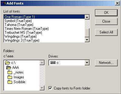
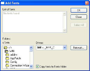
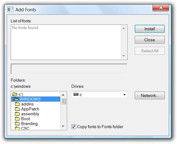
It seems familiar, though. That's because it hasn't changed in any incarnation of Windows up to the present day. That's right! Observe:
Windows 95/98/ME/2000
Windows XP
Windows Vista
Slightly ridiculous, no? Admittedly it's not "broken", and it's not really causing much of a problem. But, given the extent to which Microsoft like to fiddle with GUIs these days, the mere fact that they decided to let this gem survive right through to 2008 could demonstrate a lack of quality control. Along with some other examples, of course.
And, if nothing else, significant variations in the look and feel of a GUI can hinder a workflow. Design rules: broken.
Bootnote
Bonus image: check out this gem from Windows XP!
